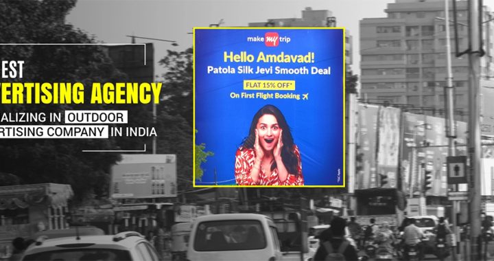
Why Minimalist Billboard Designs Deliver Better Brand Recall
4 min read
Walk into any marketing department and you’ll find a common enemy: the urge to “fill the space.” We see a massive blank canvas in a mall or on a highway and our ego tells us to pack it with features, benefits, and three different phone numbers. We think we’re being thorough. In reality, we’re just building a wall of noise that the human brain is programmed to ignore.
Minimalism in billboard advertising design isn’t about being “artsy” or “modern.” It’s about survival. In a world where everyone is shouting, the person who whispers clearly is the only one who actually gets heard. Here is why the “less is more” approach isn’t just a design choice it’s a memory hack.
1. The “Three-Second” Brutality
A shopper walking through a mall or a driver passing a pylon isn’t an “audience.” They are a person in motion. They have exactly three seconds to digest what you’re saying before their brain switches back to their own internal monologue.
If your billboard has a paragraph of text, you’ve already lost. A minimalist design works because it doesn’t ask for permission to be understood. It delivers one sharp image and one punchy headline. By the time they’ve blinked, they’ve already swallowed your brand. If you make them work for it, they’ll just look away.
2. Respect the “White Space”
In design, what you don’t show is just as loud as what you do. We call this “Negative Space,” but you can just think of it as “Breathing Room.”
Malls are visually exhausting. They are a sea of neon, moving crowds, and competing logos. When a shopper sees a giant billboard that is 80% solid color with just one crisp product shot in the center, it acts as a visual “reset.” It’s like a moment of silence in a crowded room. That contrast is what makes the ad “pop.” It forces the eye to land exactly where you want it on your product.

3. The “Encyclopedia” Trap
A billboard is a “teaser,” not a brochure. Its only job is to make someone remember your name or feel a specific vibe.
Minimalist designs deliver better recall because they focus on one single idea. The Cluttered Ad: “We sell the best coffee, it’s organic, we have 10 locations, and we’re open late!”
-
The Minimalist Ad: A high-res photo of a steaming cup with the word “Tomorrow?” and your logo.
The second ad wins every time. Why? Because it plants a seed. It invites the consumer to finish the thought in their own head. When a person “completes” a message themselves, they are 10 times more likely to remember it later.
4. Confidence is Quiet
One of the biggest killers of brand recall is a logo that is too busy or surrounded by “junk.” Minimalist billboards often shrink the logo or tuck it into a corner with plenty of space around it.
This seems backwards, right? Every client wants to “make the logo bigger.” But when a logo is surrounded by empty space, it actually looks more premium. It radiates authority. It tells the consumer, “We are so well-known, we don’t need to scream at you.“ That quiet confidence sticks in the memory far longer than a giant, crowded logo that looks desperate for attention.
5. Don’t Pitch to the Logic; Pitch to the Gut
The logical part of our brain wants facts and features. But the emotional part the part that actually makes a purchase reacts to colors, shapes, and feelings.
Minimalist billboards bypass the “logic filter” and go straight for the gut. A bold red background triggers excitement; a soft blue triggers trust. By stripping away the “noise” of text and data, you allow raw visual elements to do the heavy lifting. You aren’t just telling them you’re a great brand; you’re making them feel it before they even realize they’ve looked at an ad.
Conclusion
The most successful billboards brandings in history weren’t built with a pen; they were built with an eraser. If you can’t explain what your brand does in five words or less, you haven’t found your brand yet.
Minimalism wins the memory game because it respects the viewer’s time and intelligence. It doesn’t beg for attention; it earns it by being clear, confident, and calm. Next time you’re looking at a design, don’t ask what you can add. Ask: “What can I take away?” Usually, the more you remove, the more your brand will stay.