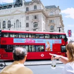
In the world of outdoor advertising, your biggest enemy isn’t your competitor it’s speed. You are designing for a distracted driver trying to change lanes, a pedestrian checking their watch, and a 12-ton vehicle that is actively pulling away from the viewer.
Research into human attention spans shows that you have exactly five seconds (often less) to make an impression before a bus disappears around a corner. If your ad is a cluttered mess of fine print, five different colors, and a long backstory, you haven’t just missed a sale; you’ve wasted your entire budget. Designing for motion is a completely different beast than designing for a smartphone screen.
Here is the “boots-on-the-ground” guide to making sure your bus ad is unmissable.
1. The “Three-Element” Rule
When a bus is moving at 40 km/h, the human brain can only process a very limited amount of information. If you try to include a headline, a sub-headline, a list of features, a website, and three social media icons, the viewer’s brain will simply “glitch” and ignore it all.
The most effective bus ads follow a strict three-element structure:
-
One Compelling Image: A single, high-quality focal point that tells the story without words.
-
One Short Headline: Five words or fewer. Think punchy, not poetic.
-
One Clear Identifier: Your brand logo or a very short, memorable name.
If you can’t explain your value proposition using only three elements, your message is too complex for transit media.

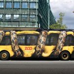
2. High-Contrast is Your Best Friend
The great outdoor advertising is notoriously unpredictable. Your ad has to remain readable under the blinding midday sun, during a grey monsoon downpour, and under yellow streetlights at night.
Forget subtle pastels or trendy “aesthetic” earth tones. You need high-contrast color pairings that “pop” from a distance of 50 feet.
-
Classic Winners: Black on yellow, white on dark blue, or yellow on black. These combinations are scientifically proven to be the easiest for the human eye to decode quickly.
-
The Squint Test: This is a trick used by professional designers. Stand back from your computer screen and squint your eyes until the image gets blurry. If you can’t immediately tell what the ad is about or recognize the brand, your contrast is too low.
3. Typography: Forget Elegance, Choose Power
Now is not the time for thin, elegant script fonts or artistic serifs with tiny “tails.” When a bus is vibrating and moving, thin lines literally disappear into the background.
-
Bold Sans-Serif is King: Use thick, heavy fonts. They provide the “weight” needed to stand out against a chaotic street background.
-
Letter Spacing (Kerning): Give your letters some breathing room. If the letters are too close together, they will bleed into one giant smudge when the bus is in motion.
-
Size Matters: Your headline should take up at least 25-30% of the total ad space. If a driver in the car behind the bus has to lean forward to read your text, you’ve already lost them.
4. Designing for the “Visual Path”
Humans generally read from left-to-right. On a bus, you want to lead the eye toward the most important information usually your brand or your offer.
If you are using a Side Panel, place your most important text on the “trailing” side of the bus (the back end of the side panel). Why? Because as a bus drives past a pedestrian, their eyes naturally follow the tail end of the vehicle as it moves away. Placing the “meat” of the ad there gives them an extra half-second of reading time as the bus exits their field of vision.

5. Be “Street-Smart” with Your Call-to-Action
Nobody is going to write down a 10-digit phone number or a complex website URL while standing at a traffic signal.
-
Visual Shorthand: Instead of a long URL, just use your brand logo and a giant “Search Us” icon.
-
The QR Code Rule: Only put a QR code on the Back Panel. Drivers stuck in traffic have the time and the steady hand to scan it. Pedestrians looking at a moving side panel will never be able to focus their camera in time it only leads to frustration.
Conclusion
The biggest mistake designers make is treating a bus advertising like a magazine page. It isn’t. It’s a split-second interaction. Your goal isn’t to tell the whole story; it’s to plant a single, powerful seed in the viewer’s mind.
If your ad is bold, high-contrast, and surgically simple, you’ll win those five seconds. If you try to be clever and wordy, you’ll just be a colorful blur on the highway.