Common Mistakes to Avoid in Mall Advertising Campaigns
3 min read
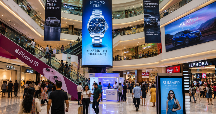
When brands jump into mall advertising, they usually have big dreams: a sea of shoppers stopping in their tracks, phones out, ready to buy. But the reality is often much quieter. Malls Advertising are high-sensory environments, and if your campaign isn’t calibrated correctly, it doesn’t just fail it becomes invisible.
If you’re planning a campaign in 2026, these are the “human” mistakes that usually kill ROI before the first shopper even walks through the door.
1. The “Times Square” Syndrome (Information Overload)
The biggest mistake advertisers make is trying to say too much. You have a massive digital screen, so you think, “Let’s list our top 10 features, our website, three QR codes, and our origin story.”
The Reality: Shoppers in a mall are moving. They are looking for the bathroom, keeping an eye on their kids, or heading to a specific store. You have about three seconds to catch their eye.
-
The Fix: Use the “Rule of Three.” One bold image, one short headline (five words or fewer), and one clear direction. If they have to stop and squint to read your ad, they’ve already walked past it.

2. The “Ghost” Call-to-Action
I see this constantly: a beautiful, high-budget video ad for a perfume or a shoe brand that looks like a movie trailer… but it doesn’t tell the shopper what to do.
The Reality: Mall ads are “Point of Sale” adjacent. If you don’t tell them where you are, you’re just building brand awareness for your competitors.
-
The Fix: Every ad needs a “Map Hook.” Instead of just “Shop Now,” use “Level 2, Next to Starbucks.” Give them a physical destination. A QR code is great, but a physical direction is what actually drives foot traffic.
3. Ignoring the “Vibe” of the Location
Malls have different zones with different energies. Placing a high-energy, loud, flashing sneaker ad right next to a luxury spa or a quiet bookstore is a massive mismatch.
The Reality: Shoppers’ moods change depending on where they are in the building. An ad that feels “annoying” or “intrusive” creates a negative brand association.
-
The Fix: Contextual placement. Put the “quick-grab” snack ads near the play areas and food courts. Put the “investment” pieces (jewelry, tech, furniture) in the high-dwell areas where people sit down or walk slowly.

4. Setting and Forgetting (The Content Fatigue)
In the digital age, seeing the same “Static” ad for three months is the fastest way to trigger “Banner Blindness.” If a local shopper sees your ad on Tuesday, and it’s the exact same on Friday, their brain will literally stop processing the image.
The Reality: Frequent mall advertising -goers (the ones who spend the most) habituate to their surroundings quickly.
-
The Fix: Rotate your creatives every two weeks. Even if the offer is the same, change the background color or the model. Keep the visual “fresh” so the brain doesn’t categorize it as “part of the wall.“
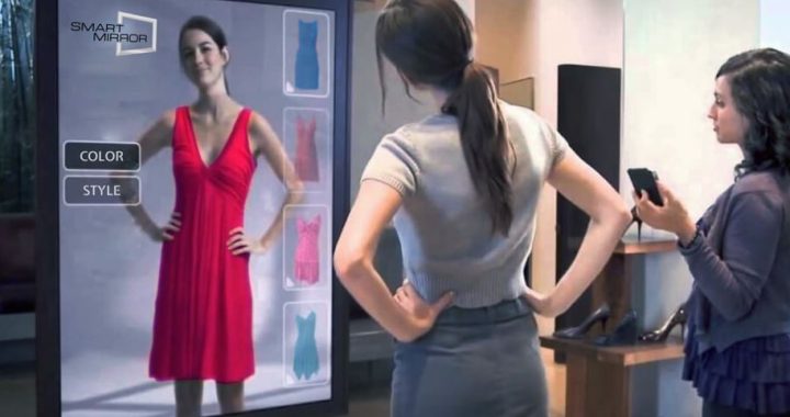
5. Tech for Tech’s Sake
Interactive screens are amazing if they work. There is nothing more depressing for a brand than a “Touch Here to Play” screen that is frozen, laggy, or showing a Windows error message.
The Reality: If your “interactive” ad is harder to use than a smartphone, people will walk away in five seconds.
-
The Fix: Low-friction interaction. Instead of complex touch-screen games that take forever to load, use “Instant AR.” A simple scan that puts a 3D filter on their phone is much more reliable and way more likely to be shared on social media.
Conclusion
Mall advertising isn’t about being the loudest; it’s about being the most relevant. The moment you stop treating the shopper like a “target” and start treating them like a person who is probably tired, a bit distracted, and looking for a bit of inspiration, your campaign will start to see results.
Avoid the clutter, give them a map, and for heaven’s sake, make sure your QR codes actually work.