Bengaluru — Interchange Station Branding (Majestic/Kempegowda): multi-format storytelling zones
4 min read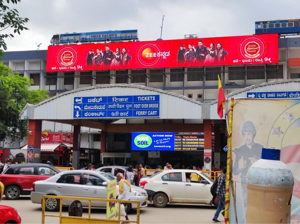
Majestic / Nadaprabhu Kempegowda Station — Key Facts & Layout
- It is the only interchange station (as of now) connecting Purple & Green Lines on Namma Metro.
- Underground, with multiple levels: Ground / Concourse, Paid area, Platforms / island platforms etc. The station has multiple entry & exit gates. Daily footfall / usage is very high: one report states ~ 2.2 lakh passengers daily, of which ~1.4 lakh are interchange-passengers (i.e. people switching lines rather than entering/exiting).
- There are concerns about congestion, especially during peak hours, because many commuters are transferring between lines; signage & wayfinding has been flagged as requiring improvement.
- A new passageway has been added/activated recently to connect certain platforms (e.g. Purple to Green) to ease commuter flow.
Why Majestic / Kempegowda Is Ideal for “Storytelling Zones” & Multi-Format Branding
Because it’s a major interchange with heavy footfall, large vertical and horizontal transit space, and dwell times (while people navigate, wait, transfer), this station offers multiple “storytelling zones”:
- Multiple levels (concourse, platform, entrances/exits) provide layered exposure.
- Transfer corridors / passageways are high dwell zones (people pausing, walking, looking for directions).
- Platforms especially the island platform for Green Line where people wait.
- Escalators, stairs, lifts where people move slowly.
These are perfect for sequential messaging, storytelling, or layered branding (“teaser → message → CTA”) etc.

Suggested “Multi-Format Storytelling Zones” & Formats
Here are specific zones inside Majestic / Kempegowda station that ideal for storytelling + format suggestions:
| Zone / Location | Format Opportunities | What Works Best / Creative Ideas |
|---|---|---|
| Station Entrance / Entry Gates | Large hoardings or billboards just outside or inside gates; LED/video boards above gates. | First impression branding. Teaser messages / brand logo + value proposition. Use motion/digital if possible. |
| Concourse / Paid area | Wall wraps, backlit panels, hanging banners, ceiling sails; digital LED screens. | Use longer narrative, build intrigue; can segment parts of story as people move. For example multi-panel creative that unfolds as commuter walks. |
| Transfer Passageways / Corridors | Strip panels, floor graphics, LED directional advertisement, animated displays. | Useful for delivering “second act” of storytelling. Good spot for QR codes or push for action since people are moving more slowly. |
| Platforms | Platform wall panels, pillar wraps, overhead panels, screen doors (if applicable), platform digital boards. | Very high dwell at platform, waiting for train. Critical visibility. Message must be bold and legible from distance. |
| Escalators / Stairs / Lifts | Escalator side panels, ceiling banners, panels on stair risers or handrails; lift doors digitally wrapped. | Movement slows people, time to read more copy. These zones allow creative layering / immersion. |
| Outer façades / Bus / Railway Station Connectivity Zones | External building wraps, directional branding, large hoardings facing the bus stand / roads. | Captures non-metro commuters, passersby, bus travellers, etc. Extends brand presence beyond just metro users. |
Footfall Analytics & Behavior Clues at Majestic / Kempegowda
- Total usage & interchange load: ~ 2.2 lakh daily; interchange traffic ~ 1.4 lakh.
- Peak congestion spots: Transfer point escalators/stairs, platforms, especially where people move between Purple & Green lines. Passageways are key chokepoints.
- Dwell times: Waiting for trains + searches for directions + movement between lines gives opportunity — people are not always rushing, many pause.
- Flow complexity & wayfinding gaps: Because signage is considered confusing / inconsistent, people pause more to orient themselves. This increases exposure time to ads / graphics around signage.
Creative Strategy for Storytelling Zones
To use Majestic / Kempegowda to its full branding potential, here’s how brands & advertisers (like MyHoardings) should craft multi-format storytelling campaigns:
- Theme & Narrative Flow
- Start with a teaser at entrance / gates; build on storyline in concourse / transfer zones; deliver the “offer / CTA” at platforms or near exits.
- Use unified visual identity across formats (colors, typography) so people recognize brand even when format changes.
- Modular Creative Design
- Split creative into panels that make sense in sequence: e.g. “Problem” message in entrance, “Solution” in corridor, “Action / Offer” on platform.
- Use striking visuals + minimal text. Interchanges are fast-moving environments; clarity is key.
- Leverage Digital / Dynamic Elements
- LED screens or digital boards can show short video loops or rotating messages.
- Dynamic content (time-of-day, weather, events) can increase relevance.
- Strategic Placement of CTA / QR / Interaction
- Place QR codes or action points at the end of the flow (platform, exits).
- Use directional signage or floor graphics to lead people toward CTA points.
- Wayfinding Integration
- Since wayfinding is a weak point, integrate branded directional graphics that also serve functional purpose. E.g. footstep floor graphics telling “This way to Platform 3/4 / Green Line / Exit B”; use brand imagery or subtle brand marks.
- This helps both commuter utility + brand recall.
- Festive / Timely Layers
- Around festivals, city events, sports etc., wrap or theme certain zones (e.g. concourse) with special visuals.
- Use outer façades or entrances gates to show vibrant seasonal creatives.
Challenges & Considerations
- Signage clutter & visual noise: Because Majestic is already busy, too many competing visuals might reduce impact. Need to pick formats / locations with less competition.
- Approval & regulation: Permissions from BMRCL, space usage rules, safety / fire / emergency access.
- Maintenance & durability: Underground stations mean lighting / moisture / wear & tear matter. Use durable materials; digital screens need maintenance.
- Readability under crowd: High crowd density can block ads; creatives should be visible from distance, not only when station is empty.
- Budget & scale: Multi-format takeovers cost more (multiple panels + digital + wraps) but can be justified at this station because of high exposure.

ROI & Efficiency
- Given daily interchange traffic (~1.4 lakh + entries/exits) and long dwell zones, a well-designed storytelling campaign here can yield very high impressions for spend.
- The overlap of formats (entrance + concourse + transfer passages + platform) gives repetition, which improves memorability.
- For brands with strong CTAs (apps, services, B2B offers), the journey from entrance to platform can be designed to lead commuters toward action (e.g. scanning QR, downloading app, visiting website) especially on the way out.
