Common Mistakes Brands Make in Airport Advertising Campaigns

Airports are often called the “Holy Grail” of marketing. They offer a high-spending, captive audience with average dwell times exceeding 90 minutes. In the high-stakes world of 2026, where every brand is fighting for a “thumb-stop” on a screen, the physical space of an airport terminal feels like a rare sanctuary of guaranteed attention.
However, this premium real estate comes with a massive trap. Many brands treat an airport like a standard roadside billboard, and in doing so, they flush their marketing budgets down the drain. To win in the terminals of Delhi, Mumbai, or London, you have to understand that a traveler is not a “consumer” they are a person in a specific emotional state. If you don’t match that state, you are invisible.
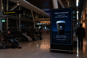
1. Ignoring the “Emotional Journey” of the Traveler
The biggest mistake brands make is treating the entire airport as a single zone. An airport is actually a series of emotional transitions. In the check-in and security areas, passengers are in a “Survival State.” They are worried about liquids in their bags, boarding passes, and long queues. Their stress levels are high, and their peripheral vision is narrow.
The Mistake: Placing a complex, story-heavy ad in a high-stress transition zone.
The Fix: Use minimalist, high-impact branding for these areas. Save the deep storytelling, interactive screens, and “lifestyle” messaging for the post-security lounges and boarding gates. This is where the traveler finally breathes a sigh of relief and looks for a distraction. This is where they are actually ready to listen.
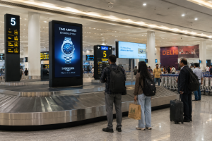
2. The “Copy-Paste” Creative Trap
Many global brands use the same creative assets for a bus stop in a suburb that they use for a premium LED screen in an International Departure lounge. This is a fatal error. A person waiting for a bus is looking for a quick utility; a person in an airport is looking for “Elevation.”
The Mistake: Using generic, low-resolution, or cluttered imagery that lacks a “Premium” feel.
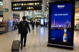
The Fix: Airport advertising is an investment in Brand Stature. Your visuals must be high-definition, elegant, and aspirational. In 2026, travelers expect a brand that advertises in an airport to be a market leader. If your creative looks like a cheap social media post, you aren’t just losing a sale you are damaging your brand’s reputation.

3. Creating “Visual Noise” Instead of Value
Terminals are already sensory overloads. Between flight announcements, glowing duty-free signs, and neon-lit cafes, the human eye is constantly searching for a place to rest. Most brands try to fight this noise by being “louder” using brighter colors, bigger fonts, and more flashing lights.
The Mistake: Cramming five product features, three social media icons, a website link, and a giant logo into one frame.
The Fix: Embrace the power of “White Space.” A clean, minimalist design with a single, powerful headline stands out because it provides the eye with a moment of calm. In a crowded terminal, the brand that whispers with elegance is often heard much more clearly than the one that screams for attention.
4. Failing to Localize the “Global” Message
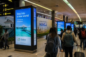
While airports are international hubs, they exist in a specific cultural heartland. A brand that ignores the local flavor of the city it is in misses a massive opportunity for emotional resonance. Travelers, especially those arriving from a different country, are often looking for a “sense of place.”
The Mistake: Using purely western imagery and English-only copy in a regional hub like Bangalore or Bhopal.
The Fix: Use subtle local nods. A mention of local landmarks or a witty “Hinglish” greeting can make a traveler feel welcomed rather than marketed to. When a brand acknowledges the city the traveler has just landed in, it stops being a faceless corporation and starts feeling like a local host.
5. The “Last-Mile” Digital Disconnect
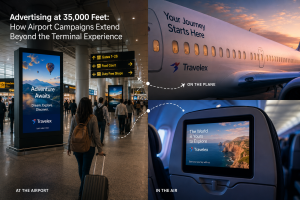
In 2026, an airport ad should never be the end of the journey; it should be the beginning. A common mistake is showing a beautiful product but giving the traveler no way to interact with it. Once they board the plane, the “intent” to buy often evaporates during the flight.
The Mistake: Having no bridge to the smartphone.
The Fix: Use “High-Value” calls to action. Instead of a boring QR code that just leads to a website, offer a scan that provides an exclusive “Traveler-Only” discount or a virtual AR experience of the product. The goal is to get your brand onto their phone before they turn on Airplane Mode. This allows the marketing journey to continue long after they have landed in their destination.

6. Poor Timing and Seasonal Laziness
Because airport ad spots are often booked for 3 to 6 months at a time, brands often “set it and forget it.” There is nothing that screams “low-effort” more than a brand running a winter-themed ad when the outside temperature is 40°C.
The Mistake: Using static, out-of-date content that doesn’t reflect the current season or flight schedules.
The Fix: If you are using DOOH (Digital Out-of-Home), change your message based on the destination of the nearest gate. If a flight to London is boarding, show an ad that appeals to business travelers. If a flight to Goa is boarding, pivot to a leisure or holiday message. This level of “Real-Time Relevance” is what justifies the premium price of airport media.
Conclusion: Becoming a Part of the Journey
Airport advertising is not about “interruption”; it is about “integration.” The brands that fail are the ones that treat passengers as a target. The brands that win are the ones that respect the traveler’s time, offer them a moment of visual beauty, and provide a clear path to continue the relationship.
In the competitive skies of 2026, being “seen” is easy, but being “remembered” is hard. By avoiding these six silent killers, you ensure that your campaign doesn’t just pass through the airport it stays with the traveler long after they’ve reached their destination.