Design Gone Wrong? Canva Gets It So Right at Waterloo Station with Bold OOH Campaign
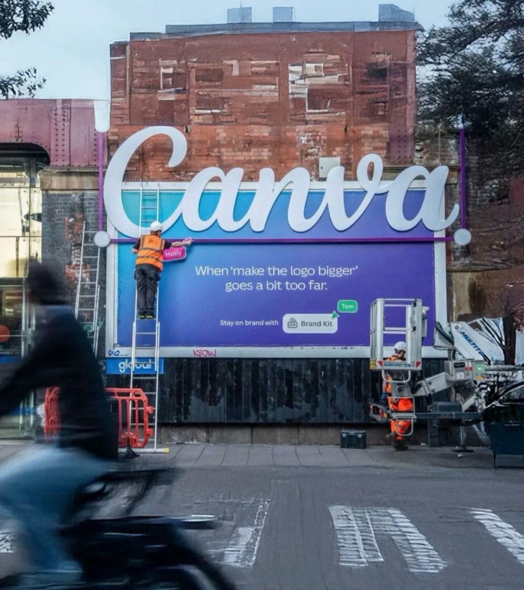
Canva has taken a refreshingly self-aware, humorous approach to outdoor advertising with its new campaign at London’s iconic Waterloo Station — and designers across the globe are loving it.
With giant posters featuring exaggerated fonts, jarring color palettes, and layout chaos, Canva has turned every common design mistake into a brilliant attention grabber — proving once again that the best way to teach design… is to show what not to do.
This clever campaign doesn’t just sell software — it sells relatability, empathy, and a deeper understanding of the creative process.
The Insight: Creatives Learn from Mistakes — Canva Just Made Them Unmissable
Waterloo Station, one of the UK’s busiest commuter hubs, now hosts a tongue-in-cheek visual playground. Canva’s new OOH (Out-of-Home) creative executions are loud, proud, and intentionally “bad.” Think:
-
Stretchy distorted text
-
Unaligned icons
-
Poor font combinations
-
Color clashes that hurt your eyes
-
Too much text in too little space
And yet, every one of these “errors” serves a clear message: Canva helps fix this.
Campaign Message: ‘You Don’t Need to Be a Designer to Avoid Design Disasters’
The campaign’s brilliance lies in its ability to speak to multiple audiences at once:
-
Professional designers smile in recognition, thinking “Oh, I’ve seen worse.”
-
Non-designers breathe a sigh of relief — “So it’s not just me?”
-
Startups and marketers get a subtle nudge: maybe it’s time to switch to smarter design tools.
Canva positions itself as the bridge between amateur design mishaps and professional polish, without sounding superior or overly instructional.
Waterloo Station: Where Bad Design Gets Good Exposure
With over 100 million monthly footfalls, London’s Waterloo Station offers Canva the perfect stage to connect with:
-
Commuting professionals working in marketing, advertising, publishing, and tech
-
Students and freelancers seeking cost-effective, easy design solutions
-
Start-up founders and SMEs passing through London’s business corridors
The commuter pause points — like platform walls, passage corridors, and digital screens — are ideal for Canva’s quick-hit, high-impact ads that stop people mid-scroll, mid-walk, mid-thought.
Creative Execution: Satirical, Sharp, and Surprisingly Shareable
The campaign’s visual style is exactly what it criticizes — but done with extreme precision:
-
Outrageous kerning errors highlighted with red circles
-
‘Comic Sans’ vs. ‘Papyrus’ font wars exaggerated to comic levels
-
Visual clutter turned into metaphor for “What not to present to your client”
-
Split creatives showing “Before Canva” and “After Canva” versions side-by-side
Each billboard becomes an educational punchline, designed for real-world viewing and social sharing.
One ad even reads:
“This poster breaks every design rule. We made it so you don’t have to.”
Why This Works: The Psychology of Recognition
What makes this campaign stick?
-
Humor as an emotional hook: People remember what makes them laugh
-
Familiarity breeds comfort: These mistakes are universal — Canva taps into shared experience
-
Problem-solution framework: The bad ad is the hook, the promise of Canva is the solution
-
Visual contrast: Amid polished ads, a “messy” ad stands out more than you’d expect
By leaning into design flaws, Canva ironically builds credibility as a design solution.
![]()
The Bigger Picture: OOH as a Canvas for Software Brands
This campaign marks a trend of SaaS and tech brands embracing traditional formats in surprising ways. Canva proves that:
-
Physical ads can reflect digital pain points
-
OOH has a creative renaissance when used for satire and storytelling
-
Transit stations are high-value zones for B2B and creator economy targeting
By placing these quirky creatives in one of London’s busiest stations, Canva isn’t just capturing attention — it’s sparking conversations.
Audience Reactions: Laughs, Likes, and Lessons
Early online traction shows that this campaign is highly shareable:
-
Designers and creative agencies are sharing pictures with hashtags like #CanvaOops and #DesignFail
-
Marketing influencers are praising Canva’s brand self-awareness and playfulness
-
LinkedIn posts have emerged from commuters, celebrating the campaign’s ability to make them “smile at 8AM”
In short, Canva just gave the design world an unintentional masterclass — through intentional mess-ups.
The Role of MyHoardings
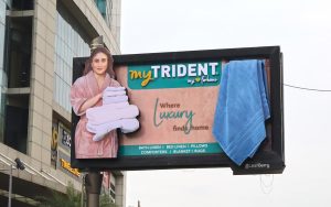
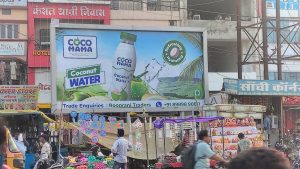
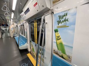
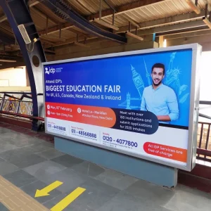
While this campaign rolled out in the UK, it reflects the kind of creative storytelling and location planning MyHoardings champions in India. From metro station branding to tech-driven OOH for SaaS, MyHoardings helps brands unlock high-traffic, high-engagement real estate with strategy and storytelling.
? business@myhoardings.com
? 9953847639
? www.myhoardings.com
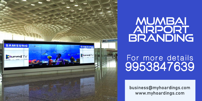
Airport Ad Media for Brand Promotion
-
01
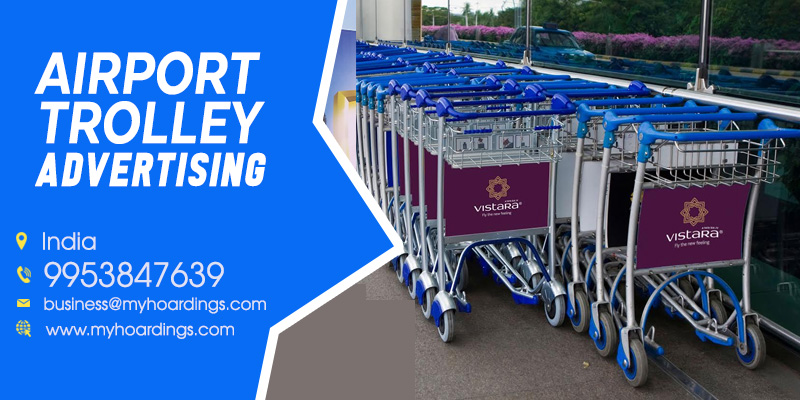
Luggage Trolley
-
02
Conveyor Belt
-
03
Airport Billboards